
If your eLearning slides feel slightly off — and you can’t quite put your finger on why — visuals are often the culprit.
A stock photo on slide three. A cartoon character on slide seven. A flat icon set that clashes with both. You built the course in pieces, and it looks like it.
The problem isn’t your taste. It’s that nobody told you how visual consistency actually works — and what it costs learners when it breaks down.
Here’s what’s at stake: when learners encounter mismatched visuals, their brain spends a small fraction of its attention resolving the inconsistency. Individually, that’s trivial. Multiply it across fifty slides, and you’ve introduced real cognitive friction. The research on this goes back to Sweller’s Cognitive Load Theory. The implication for eLearning designers is straightforward — every visual element either earns its place by supporting learning, or it costs something.
Good illustration libraries help you avoid that cost. The libraries below are free, beginner-accessible, and worth understanding before you build your next course.
Character Libraries for Scenario-Based eLearning
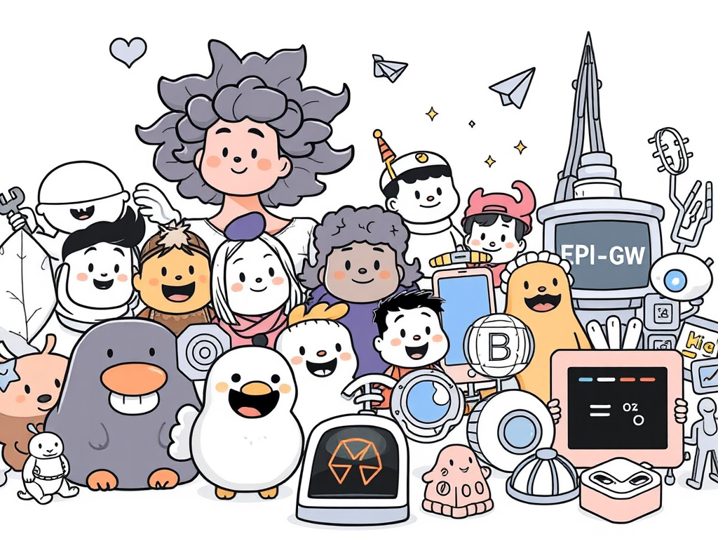
Humaaans (humaaans.com) and Open Peeps (openpeeps.com) are the two most useful free character sets for eLearning designers building scenario-based training.
Both are mix-and-match systems. You can adjust poses, skin tones, outfits, and expressions to build a cast of characters that feel like they belong in the same world. That consistency matters more in eLearning than designers usually expect — when characters look like they came from the same visual universe, learners read your course as intentional. When they don’t, something feels off, even if learners can’t articulate what.
Licensing note: Humaaans is free for personal and commercial use under Creative Commons CC BY 4.0, which requires attribution. Open Peeps is public domain (CC0) — no attribution required. If you’re building courses for a client or employer, that distinction matters.
Format and compatibility: Both are available as SVG and PNG files, which import cleanly into Storyline and Rise. Humaaans also offers a Figma component library if you’re doing more advanced customization.
3D Icon Libraries for Technical and Abstract Topics
Some topics don’t photograph well. Cybersecurity threats, data flows, network infrastructure — these are abstract by nature, and stock photos of people staring at laptops don’t communicate much.
Shapefest (shapefest.com) offers a large library of 3D icons and objects that work well for technical and systems-focused content. The aesthetic is clean and modern, the library is searchable, and the free tier is generous enough for most eLearning projects.
Use 3D icons when your content is abstract enough that literal photography doesn’t help — and when you want a tech-forward visual feel without building anything in a 3D tool yourself. The constraint is the same as any other visual system: pick it, and stick with it throughout the course. Don’t use 3D icons on some slides and flat icons on others.
Licensing: Free for personal and commercial use. Check individual asset pages for specifics before using in client work.
Motion Libraries for Micro-Interactions
LottieFiles (lottiefiles.com) is a library of small, lightweight animations — the kind that signal progress, confirm a correct answer, or give subtle feedback after an interaction.
Motion in eLearning is easy to misuse. Full-screen animations that play on every slide entry add stimulation without adding meaning. That’s the wrong kind of motion. The right kind is small and purposeful: a checkmark animation after a correct response, a brief loading indicator, a gentle visual cue that something happened.
Lottie files are JSON-based and lightweight, which matters if you have any file size limits. Storyline 360 supports Lottie animations natively via the Lottie widget. Rise doesn’t support them directly, but you can embed them through a custom block workaround.
The Real Problem Isn’t Finding Libraries — It’s Knowing When to Stop
Most eLearning designers don’t struggle to find free illustrations. They struggle to stop finding them.
You save Humaaans to a folder. Then you find a great icon set. Then a 3D library. Then a texture pack. You’re collecting — and collection feels like progress because you’re building resources. But it isn’t design. It’s accumulation.
Curation is different. Curation means you’ve looked at five options and deliberately chosen one. It means you’ve decided what your course needs and said no to everything that doesn’t serve that need. That discipline — not the number of libraries you’ve bookmarked — is what separates a polished-looking course from a scattered one.
The mental model is simple: choose one visual system per project, the same way you’d choose one typeface. Everything in that course should feel like it came from the same creative decision. When it does, learners don’t notice the visuals — and that’s exactly right. They should be focused on the content.
Where to Go Next
Oleg Frolov at muz.li published a thorough roundup of free illustration libraries for 2026 that goes well beyond what’s covered here — worth bookmarking if you want the full landscape: muz.li roundup.
But don’t start there if you’re new to this. Start with one library from this list. Open your current project. Replace the mismatched visuals with a single consistent style. Then look at the before and after.
That’s the exercise. Everything else follows from it.
