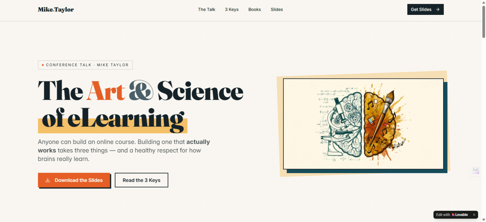
I recently presented at the iSpring 2026 online conference. The session was called The Art & Science of eLearning, and the core idea was pretty simple:
Anyone can do eLearning.
Not just anyone can do it well.
Here’s a quick rundown of what we covered.
Anyone Can Build It. That’s the Problem.
The tools have never been more accessible. But accessible isn’t the same as effective. Good eLearning sits at the intersection of a lot of disciplines — instructional design, neuroscience, graphic design, storytelling, and marketing. When you hand powerful tools to people without the right foundation, the results are usually… not great.
Key 1: The Right Thing
Before you build anything, ask yourself: is this actually a training problem?
Most of the time, it isn’t. Look at the real performance factors, and you’ll usually find the culprits are unclear expectations, missing tools, bad incentives, or broken processes. Carl Binder’s Six Boxes Model makes this visual. Only one box points directly to training: skills and knowledge.
Ron Zemke had a great line about this — management demanding a course right now isn’t a valid excuse for lousy training. Push back. Do the analysis. Mager and Pipe’s Analyzing Performance Problems is still one of the best tools for this work, and it holds up.
Key 2: The Right Way
This is where most eLearning falls apart. The most common mistake? Too much information, not enough time to actually process it. Dr. John Medina called it force feeding with very little digestion in Brain Rules.
The problem is working memory. It’s a tiny bottleneck between what your learner sees and what actually sticks. Cram too much through that bottleneck and you’ve lost them.
A few principles that help: reduce cognitive load, lead with curiosity before content, and remember — telling ain’t training. If your course is just a series of narrated bullet points on a screen, it’s a document. Not learning.
Key 3: The Right Visuals
This one gets underestimated. Design isn’t decoration — it’s function. Research shows 94% of first impressions are tied to visual design. And those first impressions impact the perception of your course’s credibility, trust and even usability. Also, pictures beat text for recall..
You don’t need to be a designer. You do need to understand a few principles: coherence, redundancy, and modality. Connie Malamed’s Visual Design Solutions is a great place to start.
Where It All Comes Together
The session closed with a three-circle Venn diagram. Right Stuff. Right Way. Right Visuals. Where all three overlap? That’s where the amazing eLearning lives.
Most courses nail one or two. Getting all three is the goal — and it’s absolutely doable.
Grab the Slides and Resources
I built a landing page with the downloadable slides and links to every book and resource mentioned in the session.
Check it out here: art-science-elearning.lovable.app

Great stuff, as always! You did a great job on your slides. This is a hot topic. I got asked to present my workshop on cognitive load and Mayers principles again at TechLearn. I expected 4 people and wound up with a packed house. You’re on to something here.
LikeLike
Thanks, Jean! That is definitely a topic that everyone should know, right? 8-)
LikeLike