A practical guide to designing learning people actually notice
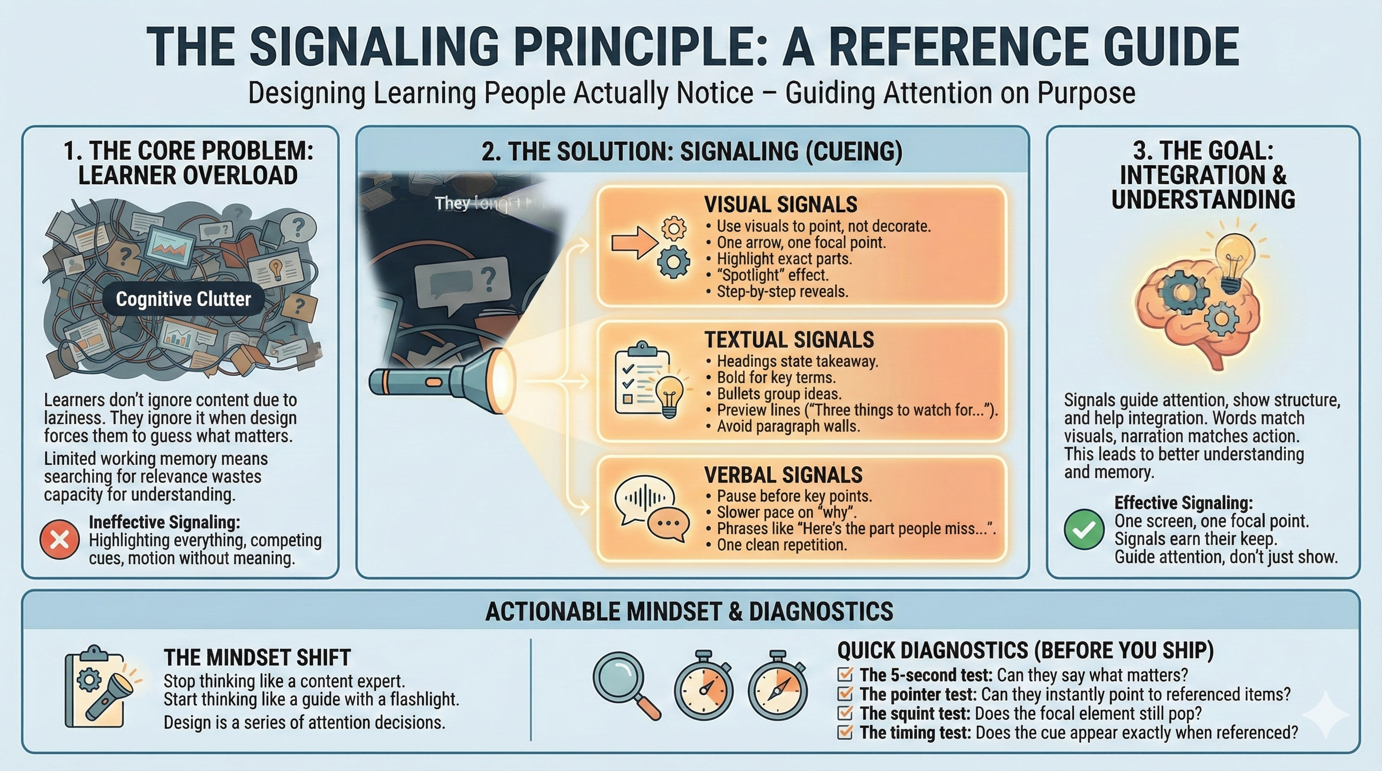
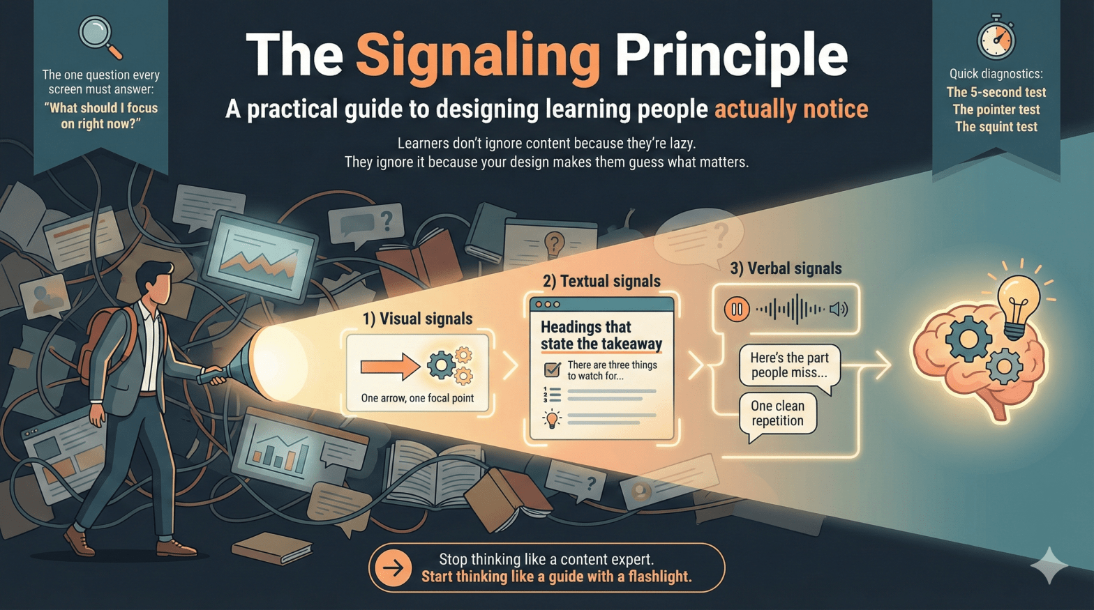
Learners don’t ignore content because they’re lazy.
They ignore it because your design makes them guess what matters.
That’s the signaling principle (cueing).
Signaling means you guide attention—on purpose.
You make the important parts easy to spot and the unimportant parts easy to ignore.
Why it works is simple: attention is limited. Working memory is limited.
When learners waste effort searching for relevance, they have less capacity left to understand, connect, and remember.
If they have to hunt for meaning, you’ve already made learning harder.
The one question every screen must answer
Every slide, screen, or interaction triggers a silent question:
“What should I focus on right now?”
Good signaling answers that question instantly.
Poor signaling makes learners answer it themselves—while also trying to learn.
That’s a bad trade.
What counts as a signal
Signals come in three main forms. None need to be fancy.
Use fewer than you want to. Make them earn their keep.
1) Visual signals
Use visuals to point, not decorate.
Effective examples:
- One arrow pointing to one element
- A highlight on the exact part being discussed
- A “spotlight” effect: dim everything except the target
- Step-by-step reveals (one idea at a time)
Ineffective examples:
- Highlighting everything
- Three arrows competing on one screen
- Motion that means nothing
Rule: One screen, one focal point.
2) Textual signals
Text is a quiet power tool.
Effective uses:
- Headings that state the takeaway (not the topic)
- Bold for key terms or decisions (sparingly)
- Bullets to group ideas, numbers to show sequence
- Preview lines: “There are three things to watch for…”
Avoid:
- Paragraph walls
- Bold-as-decoration
- Vague headings like Overview
If everything is emphasized, nothing is.
3) Verbal signals
Your voice is part of the design.
Signals include:
- A pause before the key point
- A slower pace on the “why”
- Phrases like “Here’s the part people miss…”
- One clean repetition
Monotone narration forces learners to guess importance.
If something matters, it should sound like it matters.
Where signaling matters most
Signaling helps almost everywhere, but it matters most when:
- The material is complex or dense
- The medium is fast or transient (video, animation, demos)
- Learners are novices
- Visuals have many parts or relationships
Novice learners don’t yet know what to pay attention to.
That’s not their flaw. That’s the assignment.
When signaling helps less (and can backfire)
Be cautious when:
- Learners already know the domain well
- The content is simple or familiar
- Signals pile up and create clutter
Here are red flags:
- If your slide has five highlights, it has zero.
- If the cue stays after the moment passed, it becomes noise.
- If learners ask “which one?” your cues are competing.
More cues doesn’t mean more learning.
It usually means more distraction.
Quick diagnostics before you ship
Use these tests before finalizing any learning artifact.
The 5-second test
Show the screen for five seconds.
Can a learner say what matters? If not, redesign.
The pointer test
When the narration references something, could a learner point to it instantly?
If not, add or improve the cue.
The squint test
Squint at the screen.
Does the focal element still pop? If not, simplify and re-signal.
The timing test
Does the cue appear exactly when the narration references it?
If it shows up early or late, learners still have to search.
🔍 Sidebar: What signals really do
Most people think signaling just means “point here.”
It does more than that.
Signals perform three jobs:
1) Guide attention
They reduce search. Search is wasted effort.
2) Show structure
They tell learners how ideas are organized: steps, parts, priorities.
Headings, previews, and numbering aren’t decoration. They’re a map.
3) Help integration
They make relationships obvious.
Words match visuals. Narration matches action. Cause links to effect.
Good signaling doesn’t just say look here.
It also says this belongs with that.
Common design mistakes
- Highlighting entire screens
- Using color or motion without meaning
- Assuming learners will “figure it out”
- Confusing engagement with clarity
Learning often fails quietly.
Confusion looks like compliance.
The mindset shift that matters
Stop thinking like a content expert.
Start thinking like a guide with a flashlight.
Your job isn’t to show everything.
It’s to guide attention, moment by moment, so learners can use their limited cognitive resources for understanding and integration.
Bottom line (and a challenge)
Design is a series of attention decisions.
Signaling makes those decisions visible.
Now do this: take one messy slide you’ve made before.
Redesign it using two signals max.
If it gets clearer, you’re doing it right.
