Category: LDToolbox

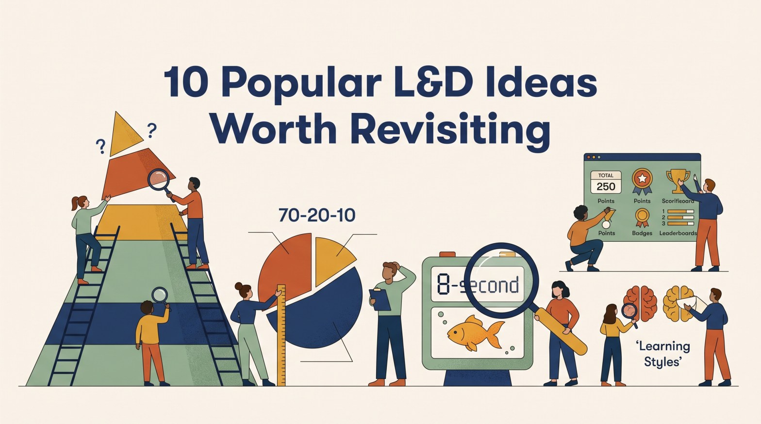
  • 10 Popular L&D Ideas Worth Revisiting

    10 Popular L&D Ideas Worth Revisiting

    Recently, I read The Untold Story of Bloom’s Taxonomy by Carl Hendrick.

    That name instantly took me back.

    Like many people in Learning and Development, I was introduced to Bloom’s years ago. I’ve seen it referenced in conference presentations, certification programs, instructional design books, and countless conversations about learning objectives. But as I read the article, I realized something uncomfortable: much of what I thought I knew about Bloom didn’t come from Bloom.

    It came from pyramids, templates, conference talks, and other people who had learned it the same way.

    That made me wonder:

    How many L&D “facts” are actually simplified versions of the original idea?

    This isn’t an attempt to tear down the profession’s favorite models. Most became popular because they’re useful. But useful isn’t the same as proven, and a model isn’t a law.

    Ideas also change as they travel. Someone trims a complex concept for a workshop. Someone else turns it into a graphic. A catchy statistic gets added. Eventually, the simplified version becomes easier to remember than the source.

    And that’s when things get interesting.

    The goal isn’t to debunk these ideas. It’s to revisit them. Some turn out to be myths. Some are good models that have been stretched beyond their original purpose. Others work quite well, but only under the right conditions.

    Here are ten L&D ideas that became simpler, more certain, and sometimes less accurate as they traveled.


    1. People Learn Best in Their Learning Style

    Verdict: 🚫 Myth

    Visual learners need pictures. Auditory learners need sound. Kinesthetic learners need hands-on practice.

    It has a nice ring to it. It also feels respectful. People are different, so surely we should teach each person in the way they prefer.

    The first part is true. People do have preferences. The second part is where the evidence weakens.

    There has been a lot of research on whether matching instruction to a learner’s preferred style improves outcomes. All of them concluded there was not an adequate evidence base for using learning-style assessments in general educational practice.

    That doesn’t mean visuals are bad or hands-on practice has no value. The best format often depends on the content. A map helps people navigate. Audio helps with pronunciation. Physical practice helps when learning a physical skill.

    The content should guide the method, not a label attached to the learner.

    Takeaway: Preferences are real. The evidence supporting instruction matched to individual learning styles is much weaker than many people assume.

    Sources

    • Pashler, H., McDaniel, M., Rohrer, D., and Bjork, R. (2009). Learning Styles: Concepts and Evidence.
    • Coffield, F., Moseley, D., Hall, E., and Ecclestone, K. (2004). Learning Styles and Pedagogy in Post-16 Learning.

    2. 70-20-10 Is a Proven Formula

    Verdict: ⚠️ Useful Idea, Weak Evidence

    You probably know the numbers:

    • 70% from experience
    • 20% from other people
    • 10% from formal learning

    They’re easy to remember, which may explain why so many people started treating them as a formula rather than an observation.

    The model grew from reports about how successful managers believed they had developed during their careers. It wasn’t a controlled experiment proving that everyone learns in those exact ratios.

    Researcher Alan Clardy reviewed the evidence and argued that support for the specific percentages was far weaker than many practitioners assume.

    None of that makes workplace experience unimportant. People clearly learn through assignments, coaching, observation, feedback, and mistakes. The issue is that an observation gradually became a prescription. Somewhere along the way, a useful reminder to look beyond formal training started being treated like a universal rule.

    Takeaway: Use 70-20-10 as a prompt to think broadly about development, not as arithmetic you must obey.

    Sources

    • Lombardo, M., and Eichinger, R. (1996). The Career Architect Development Planner.
    • Clardy, A. (2018). 70-20-10 and the Dominance of Informal Learning: A Fact in Search of Evidence.

    3. Bloom’s Taxonomy Is a Staircase

    Verdict: ⚠️ Useful Model, Often Misapplied

    Most of us know Bloom’s as six levels stacked in a pyramid:

    Remember. Understand. Apply. Analyze. Evaluate. Create.

    That image encourages a tidy story. Start at the bottom, move upward, and aim for the top because creating is always best.

    The real story is more nuanced.

    Bloom’s original taxonomy was designed to classify educational objectives and create a shared language for discussing them. It included a hierarchy, but it wasn’t intended as a universal instructional process that every lesson must follow.

    Creating isn’t automatically the right goal. If I’m learning an emergency procedure, accurate recall may matter far more than producing something new. Experts also move back and forth among different types of thinking rather than climbing a ladder one rung at a time.

    Takeaway: Bloom’s can help align goals, instruction, and assessment. It shouldn’t dictate a rigid sequence for every learning experience.

    Sources

    • Bloom, B. (1956). Taxonomy of Educational Objectives.
    • Anderson, L., and Krathwohl, D. (2001). A Taxonomy for Learning, Teaching, and Assessing.
    • Hendrick, C. The Untold Story of Bloom’s Taxonomy.

    4. People Remember 90 Percent of What They Do

    Verdict: 🚫 Myth

    You’ve probably seen the graphic.

    People remember:

    • 10% of what they read
    • 20% of what they hear
    • 90% of what they do

    Those numbers are frequently connected to Edgar Dale’s Cone of Experience.

    Perhaps the most surprising part of the famous retention chart is that the percentages most people remember never appeared in Dale’s original work.

    His cone described different types of learning experiences ranging from more concrete to more abstract. The retention statistics appeared later and have no clear research foundation.

    That doesn’t mean practice is ineffective. Practice can be incredibly valuable. But retention depends on many factors, including prior knowledge, attention, retrieval, feedback, spacing, and context. No honest chart can reduce all of that complexity to three neat percentages.

    Takeaway: Learning by doing can be powerful. The famous retention numbers are not supported by strong evidence.

    Sources

    • Dale, E. (1946). Audio-Visual Methods in Teaching.
    • Thalheimer, W. (2006). People Remember 10%, 20%…Oh Really?

    5. People Have an Eight-Second Attention Span

    Verdict: 🚫 Myth

    The story goes like this:

    Human attention spans have shrunk to eight seconds. That’s supposedly shorter than a goldfish.

    Therefore, every learning experience should be tiny.

    It’s a memorable claim. It’s just not a well-supported one.

    While attention is undoubtedly affected by our environment, researchers have struggled to find evidence supporting a universal eight-second human attention span. People still lose themselves in novels, hobbies, games, and multi-hour projects.

    The issue isn’t that humans suddenly forgot how to focus. It’s that attention now competes with more distractions than ever.

    Takeaway: Don’t design around a goldfish statistic. Earn attention through relevance, clarity, challenge, and good pacing.


    6. Adults Learn in a Completely Different Way Than Children

    Verdict: ⚠️ Useful Perspective, Ongoing Debate

    Adult Learning Theory gave L&D an important reminder: adults bring experience, responsibilities, motivations, and a need for relevance.

    The trouble begins when those useful observations become a rigid divide.

    Adults are self-directed. Children are dependent. Adults are internally motivated. Children are externally motivated.

    Real people are messier than that.

    Recent critiques have questioned whether adult and child learning differ as sharply as andragogy is often portrayed. Some scholars argue that while adults and children may learn in different contexts, the underlying mechanisms of learning are often more similar than traditional descriptions suggest.

    That’s not an argument against relevance, autonomy, or experience. It’s a reminder that human learning is usually more complicated than a checklist.

    Takeaway: Design for the people and situation in front of you, not for a simplified description of what all adults supposedly have in common.

    Sources

    • Knowles, M. (1973). The Adult Learner: A Neglected Species.
    • Knowles, M. (1980). The Modern Practice of Adult Education.
    • Moll, I. (2024). A Psychological Critique of Knowles’ Andragogy as a Theory of Learning.

    7. Kirkpatrick Proves the Training Worked

    Verdict: ⚠️ Useful Framework, Often Oversimplified

    The problem with Kirkpatrick isn’t Kirkpatrick. It’s the tidy staircase many of us were taught.

    Too often, the four levels become a checklist: Did people like the training? Did they pass the test? Did their behavior change? Did business results improve?

    That creates a neat story from Reaction to Results. But a neat story is not proof. Each connection still needs evidence.

    The updated model is more connected and iterative than the familiar staircase suggests. It starts with the results an organization needs, works backward to the behaviors that support them, and asks what must happen on the job to sustain those behaviors. Training is only one part of that system.

    So the question isn’t whether Kirkpatrick is right or wrong. It’s whether we use the model to guide better questions or treat it as automatic proof that training caused the result.

    Takeaway: Use Kirkpatrick to build a chain of evidence, not a ladder of assumptions. Start with the result, identify the behavior that could influence it, and test each connection.

    Sources

    • Kirkpatrick, J. D., & Kirkpatrick, W. K. (2016). Kirkpatrick’s Four Levels of Training Evaluation. ATD Press.
    • Cahapay, M. (2021). Kirkpatrick Model: Its Limitations as Used in Higher Education Evaluation.

    8. Engagement Means Learning

    Verdict: ⚠️ Useful Measure, Weak Evidence

    The room was lively. The chat was flying. Learners were clicking, commenting, laughing, and participating.

    Success, right?

    Maybe.

    One of the easiest traps in L&D is confusing evidence of activity with evidence of learning. The two often overlap, but they’re not the same thing.

    Researchers and learning scientists have long argued that learners are not especially good judges of their own learning. In Make It Stick, Brown, Roediger, and McDaniel describe how learners often mistake familiarity, fluency, and enjoyment for durable learning. Techniques that feel easy and engaging can create an illusion of learning, while techniques that feel more difficult may produce stronger long-term retention.

    The same theme appears throughout How Learning Happens by Paul Kirschner and Carl Hendrick. Learning is not always obvious while it’s happening. A learner can feel confident without learning much, and they can feel challenged or uncertain while making significant progress.

    That doesn’t mean engagement is unimportant. Few people learn effectively when they are distracted, confused, or completely disengaged. Attention matters. Motivation matters. Participation matters.

    The problem comes when we stop there.

    A crowded discussion board doesn’t prove understanding. High completion rates don’t prove retention. A great satisfaction score doesn’t prove behavior change or improved performance.

    In other words, engagement may be a useful leading indicator, but it’s a poor substitute for evidence that learning actually occurred.

    Takeaway: Engagement can support learning, but it isn’t learning. Measure attention, participation, and satisfaction if they’re useful. Just don’t mistake them for retention, transfer, or performance improvement.

    Sources

    • Brown, P., Roediger, H., and McDaniel, M. (2014). Make It Stick: The Science of Successful Learning.
    • Kirschner, P., and Hendrick, C. (2020). How Learning Happens.
    • Clark, R., and Mayer, R. (2023). e-Learning and the Science of Instruction.

    9. Microlearning Is Better

    Verdict: ✅ Context Dependent

    Unlike some items on this list, microlearning has meaningful evidence behind it.

    Recent systematic reviews have reported generally positive outcomes across multiple studies while also noting significant variation in definitions, implementation approaches, and research methods.

    The issue isn’t that microlearning never works. The issue is that “make it shorter” has become an answer before we’ve asked the question.

    A short lesson may be ideal for a refresher, job aid, or narrowly focused task. Building a complex skill is a different challenge entirely. Some capabilities require time, feedback, repetition, coaching, and sustained practice.

    Breaking a weak course into ten shorter pieces doesn’t improve the content. It simply gives you ten smaller pieces of weak content.

    Takeaway: Short is a format, not a strategy. Good design starts with the need.

    Sources

    • Monib, W., Qazi, A., and Apong, R. (2025). Microlearning Beyond Boundaries: A Systematic Review and a Novel Framework for Improving Learning Outcomes.

    10. Gamification Works

    Verdict: ✅ Context Dependent

    Points. Badges. Leaderboards.

    Done, right?

    Not quite.

    Research generally supports the idea that well-designed gamification can improve learning outcomes. However, the size of those effects varies considerably depending on the audience, content, design approach, duration, and learning environment.

    That’s a much more useful conclusion than either extreme: “Gamification works” or “Gamification is a gimmick.”

    A leaderboard may motivate one audience and discourage another. A storyline may add meaning or add noise. A challenge may promote useful practice or reward speed on the wrong task.

    Like most instructional tools, it depends on how it’s used.

    Takeaway: Game elements are ingredients. Their value depends on what you’re trying to make.

    Sources

    • Li, M., Ma, S., and Shi, Y. (2023). Examining the Effectiveness of Gamification as a Tool Promoting Teaching and Learning in Educational Settings: A Meta-Analysis.
    • Kapp, K. (2012). The Gamification of Learning and Instruction.

    The Bigger Lesson

    The point isn’t that L&D has been foolish. It’s that useful ideas change as they travel.

    A model starts with nuance. Someone trims it for a workshop. Someone turns it into a pyramid. A memorable statistic gets attached. Before long, the simplified version becomes easier to remember than the source.

    That’s how a guide becomes a rule, a ratio becomes a law, and a preference becomes a learning need. The transformation happens gradually, usually with good intentions. Each simplification makes the idea easier to teach and remember. Unfortunately, it can also make the idea less accurate.

    We don’t need to throw away every familiar model. We do need to hold them a little more lightly.

    Ask where an idea came from. Check what the original source actually claimed. Look for the limits, not just the headline. Then decide whether the model fits the problem in front of you.

    Models help us think. Problems begin when we stop thinking and let the model do it for us.

    The goal isn’t to collect more frameworks. It’s to stay curious enough to revisit the ones we already know.

    Because in a profession built around learning, some of the most valuable lessons come from what we’re willing to unlearn.

  • Why We Kept Our Learning Games Out of the LMS

    Why We Kept Our Learning Games Out of the LMS

    This year, we created a series of 90s-themed cybersecurity games to support our annual compliance campaign.

    Designing the games was the fun part.

    Then came the less glamorous question:

    How would we track who completed them?

    The obvious answer was our LMS. It was also a much bigger answer than we needed.

    The Games Expanded the Campaign

    Our employees already had an annual cybersecurity course to complete. The games weren’t meant to replace it. They gave people more ways to notice, explore, and talk about the campaign around it.

    These were short, fun challenges or browser-based games. One took employees through a social engineering scenario. Another turned a password challenge into a character reveal.

    The 90s television theme gave the campaign a personality. Leaderboard points and prize drawings added curiosity and friendly competition.

    This is the approach Bianca Baumann and I advocate in Think Like a Marketer, Train Like an L&D Pro: don’t assume good learning will attract attention on its own.

    Marketers create several ways for people to encounter a product. We wanted to create several ways for employees to encounter cybersecurity.

    The annual course delivered the required learning. The games helped the larger campaign earn attention.

    But every game raised the same tracking question.

    What Did We Actually Need to Know?

    As instructional designers, we’re good at building systems.

    Sometimes a little too good.

    A simple tracking request can quickly grow into conversations about LMS settings, SCORM packages, dashboards, data models, automation, and reporting rules.

    Before building any of that, we stopped and asked:

    What problem are we actually trying to solve?

    We needed to know three things:

    • Who completed each game?
    • Who earned leaderboard points?
    • Who qualified for prize drawings?

    We weren’t issuing certificates. The games weren’t part of anyone’s compliance record. We didn’t need detailed data about every click or choice.

    We just needed to connect a completed game to an employee.

    One Form. One Question.

    Each game ended with a completion result. Depending on the activity, that might be a generated code, secret phrase, puzzle answer, or character name.

    Employees clicked a link and entered that result in a Microsoft Form.

    That was the entire process.

    Because they were already signed in through Microsoft 365, Forms captured their identity and submission details. We didn’t need to ask for a name, email address, employee ID, department, or business unit.

    The form had one question:

    What is your completion code?

    Why We Didn’t Use the LMS

    We could have placed each game in our LMS. That would have provided more formal tracking.

    It also would have created more work on both sides.

    Employees might have needed to open the LMS, locate the right activity, launch it, move through several screens, and confirm completion.

    None of those clicks would have improved the game. They would have created more distance between “That looks fun” and actually playing.

    The LMS would have added work for our team too. Each activity would need to be packaged, uploaded, configured, tested, and maintained.

    Even a small change could become a project. Fixing one instruction might mean editing the source, publishing the package again, replacing it in the LMS, and testing it one more time.

    With Forms, we could update an instruction or code in minutes.

    The LMS wasn’t the wrong tool. It was simply more tool than this job required.

    Friction Works Both Ways

    We often discuss friction as a learner problem. Every field, login, and extra click asks for a little more time and attention.

    But learning teams pay for friction too.

    They pay through added development, more testing, slower updates, and ongoing maintenance.

    That doesn’t mean we should collect no data or avoid robust systems. It means the value of the information should justify the effort required to collect it.

    For required compliance training, detailed records matter.

    For a voluntary game and prize drawing, a one-question form may be enough.

    The tracking method should match the stakes.

    Our System Wasn’t Airtight

    A submitted code showed that an employee had the code. It didn’t prove, beyond all doubt, that the person completed every part of the game.

    Someone could share an answer.

    We accepted that risk because these were optional campaign activities, not certifications or legal records. Making participation easy mattered more than building perfect proof.

    Different stakes would have led to a different decision.

    Simple worked because it was appropriate, not because simple is always better.

    We Added Complexity When It Earned Its Place

    Later, we connected the Forms data to Power Automate. That helped us manage leaderboard points and other campaign features.

    We didn’t reject complexity. We added it when it produced clear value.

    That sequence matters.

    Start with the smallest system that solves the real problem. Then add new parts when you can explain exactly what they improve.

    Otherwise, every new layer becomes something your team has to build, test, maintain, and feed.

    The Bottom Line

    The games helped our cybersecurity campaign earn attention.

    Microsoft Forms lets us track participation without taking that attention away.

    That’s the larger lesson. Treat learning like a product that needs to be marketed. Create reasons for people to notice it, explore it, and talk about it.

    Then choose support systems that fit the purpose and stakes of the experience.

    Nobody talked about our form.

    Nobody talked about the automation.

    Nobody talked about the reporting.

    They talked about the games.

    That was the clearest sign that we had spent our time on the right things.

  • Five Studies That Shaped My Thinking About Training

    Five Studies That Shaped My Thinking About Training

    When training fails, our first instinct is often to add something.

    Another explanation. Another example. Another module. Maybe a quiz with three answers nobody could possibly get wrong.

    But what if content isn’t the problem?

    I recently reviewed 50 studies from psychology, behavioral science, and learning research. I chose them for their influence, historical value, and usefulness at work.

    Several of them highlight that training isn’t always the answer.

    Here are five that changed how I think about performance.

    Get the complete 50-study field guide

    Want the other 45? I compiled all 50 studies, along with their limitations, workplace applications, and practical ideas, into a free field guide.

    ​

    ​

    A layout problem can become a learning problem

    Picture a diagram on one side of a screen and its explanation on the other. Your eyes bounce back and forth. Meanwhile, your brain tries to hold one piece in memory while searching for the next. That mental juggling has a cost. Paul Chandler and John Sweller called it the split-attention effect. When people must combine related information from different places, the layout itself can interfere with learning.

    Split attention—and related attention problems—can appear when we:

    • Put a legend far from the visual it explains
    • Separate instructions from the task
    • Make employees switch between systems to assemble one answer
    • Show visuals that compete with the narration
    • Add decoration that steals attention

    The lesson is not “make everything shorter.” It is this:

    Make important relationships easier to see.

    Try this: Find one screen that separates information people must understand together. Put those pieces side by side—but don’t duplicate information that already makes sense on its own. ​

    ​

    Remembering beats reviewing

    Rereading feels productive.

    The words look familiar. The page makes sense. We nod along and mistake recognition for mastery.

    Then we need the information three days later—and it has vanished.

    Henry Roediger and Jeffrey Karpicke compared repeated study with retrieval practice: asking people to recall what they had learned.

    Repeated study performed better after a very short delay. Retrieval produced stronger retention later.

    That difference matters.

    If people need knowledge on the job, they should practice retrieving it from memory—not merely looking it up again.

    A quiz should not be the inspection station at the end of a course. Used well, it can help create the learning.

    Try this: Before reviewing something you have already taught, ask learners to recall it without looking. Then provide the correct answer and useful feedback.

    Effort helps when success is possible and feedback follows. Blind frustration does not.


    Impact becomes real when it has a face

    Organizational psychologist Adam Grant and his colleagues studied university fundraising callers.

    Some callers met a scholarship student whose education had been funded by their work.

    The script stayed the same. So did the pay.

    But the callers could now picture someone who benefited when they picked up the phone. After meeting the student, they worked longer and raised more money.

    Now compare that with the language we often use to introduce workplace training:

    • Maintain compliance
    • Reduce organizational risk
    • Support strategic priorities
    • Complete this requirement by Friday

    Technically accurate. Emotionally dead.

    Grant studied direct contact with a beneficiary, not whether a good story can rescue a dull compliance course. But the design question travels well:

    Can employees see the person their actions affect?

    Who stays safe? Whose work becomes easier?

    Try this: Replace “This training is important because…” with a real example of someone affected by the behavior.

    Don’t just explain the requirement. Give the consequence a face.


    Information cannot fix a friction problem

    Imagine you know exactly what to do.

    Then you meet the form.

    The instructions are vague. The button you need is buried three menus deep. One approval takes four days, and nobody knows who owns it.

    Would another course help?

    Eric Bettinger and his colleagues studied families applying for college financial aid. One group received personalized information. Another received the same information, plus hands-on help completing and submitting the application.

    The help changed behavior. Information alone did much less.

    The workplace parallel is hard to miss. We prescribe training when the real obstacle is:

    • A confusing form
    • A buried button
    • Too many approvals
    • An unclear process
    • A lack of time
    • A system designed like an escape room

    If people already know what to do, more content is unlikely to save the day.

    Try this: Before building training, watch someone perform the task. Count the clicks, decisions, delays, handoffs, and chances to give up.

    You may not have a knowledge problem. You may have a friction problem.

    Sometimes the right intervention is not better instruction. It is fixing the system.


    A badly framed norm can make behavior worse

    In a well-known field experiment, households learned how their energy use compared with their neighbors’.

    The heavy users cut back.

    But some households that had used less energy began using more. Once they saw the average, they drifted toward it even though that meant doing worse.

    A small sign of approval, a smiley face, stopped that boomerang effect.

    Now consider this workplace message:

    Thirty percent of employees still click suspicious links.

    The intended message is clear:

    This behavior needs to change.

    But employees may hear something else:

    Plenty of people do it. I wouldn’t be unusual.

    Never make the behavior you want to stop sound normal.
    When you use a social norm, make it truthful and pair it with clear approval of the desired behavior.

    If your data support it, you might say:

    Most employees report suspicious messages when something doesn’t look right. Thank you for helping protect your coworkers.

    What if the desired behavior is not common yet?

    Don’t invent a statistic. State the standard:

    Reporting a suspicious message is exactly the response we want. Every report helps protect the people around you.

    Try this: Review one message about poor behavior. Does it make the problem sound normal—or the solution?


    The Bottom Line

    These studies examine different problems, but they point in the same direction:

    Performance depends on more than content.
    People must notice what matters. They must recall it when needed, see a reason to act, have a workable path, and believe the behavior belongs here.

    Training can help.

    But it cannot repair a cluttered design, bring an empty mandate to life, remove a broken process, or overpower a culture that rewards the wrong behavior.

    Sometimes the smartest move is to improve the training.

    Sometimes it is to fix what stands in the way.

    What workplace learning problem should I investigate next?

  • The Dual Coding Problem: Why Your Learners Keep Tuning You Out

    The Dual Coding Problem: Why Your Learners Keep Tuning You Out

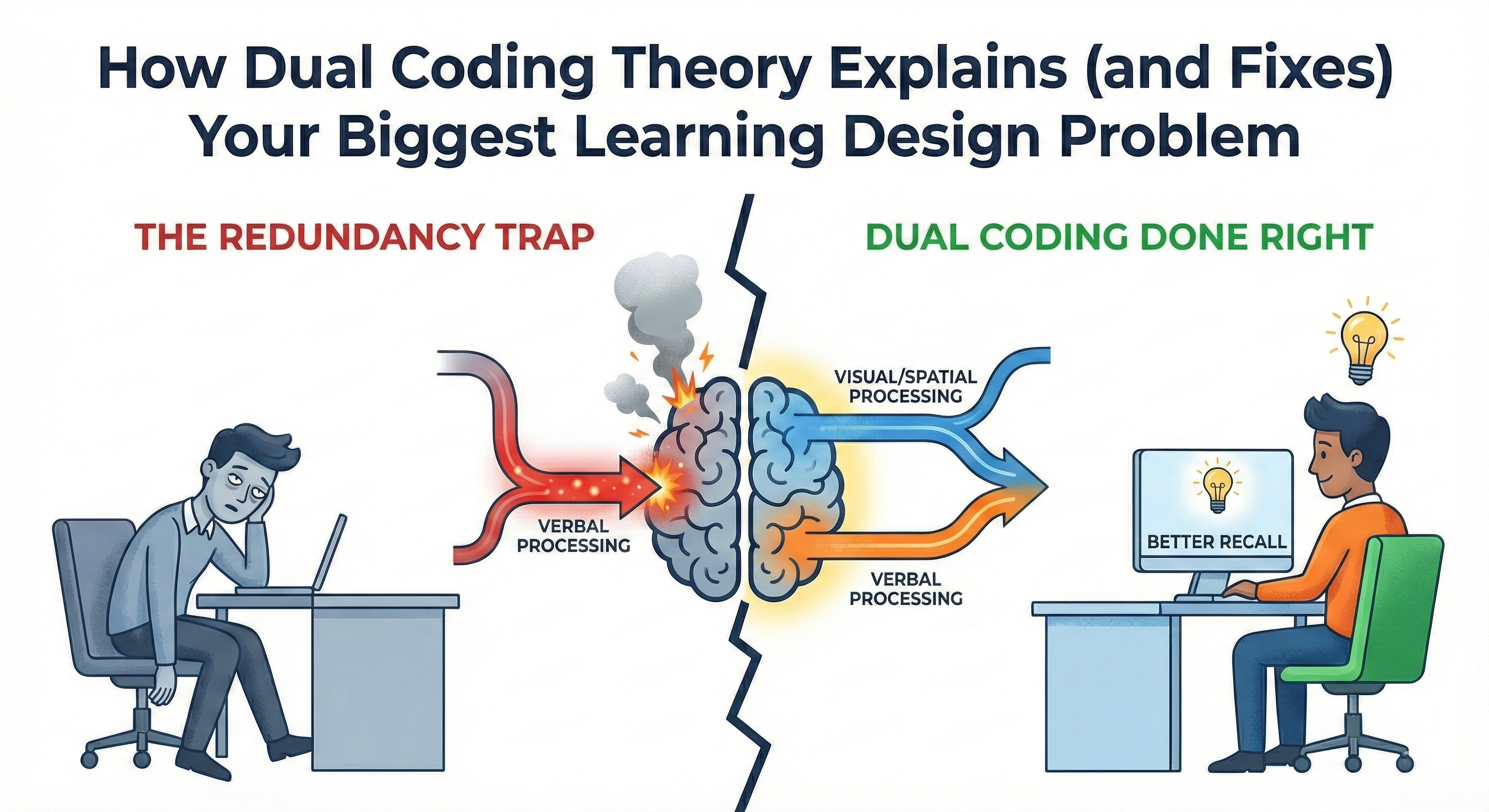
    How Dual Coding Theory Explains (and Fixes) Your Biggest Learning Design Problem

    Your learners look glazed over. They’re reading ahead while you talk. Or they’ve checked out entirely.

    You know what they’re doing? Choosing.

    Read the slide or listen to you. Not both. They can’t. And it’s not their fault—it’s your design.

    Your Brain Processes Information Through Two Separate Systems

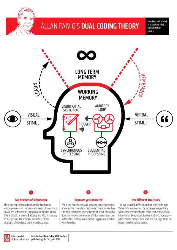
    In 1971, psychologist Allan Paivio proposed dual coding theory. The core insight: your brain has two distinct processing channels. One handles visual and spatial information—images, diagrams, animations. The other handles verbal information—language and words.

    The critical detail most people miss? It’s not about eyes versus ears.

    Text on a slide gets processed through the verbal channel, even though you see it with your eyes. Your brain recodes written words into linguistic form. So when you put bullet points on screen and read them aloud, you’re forcing the verbal channel to process identical information from two sources simultaneously.

    Think of two conveyor belts feeding into working memory. One carries visual representations. The other carries language. When each belt carries complementary information, learning compounds. You get multiple retrieval pathways, stronger encoding, better recall.

    But pack identical information on both belts? The system jams.

    Richard Mayer’s multimedia learning research confirmed this. People learn better from words and pictures together than from words alone—but only when those words and pictures complement rather than duplicate each other.

    The Redundancy Trap

    Most training designers make the same mistake: text on slide, narration reading that text.

    You’ve seen it. Probably done it.

    The problem isn’t repetition for emphasis. The problem is cognitive cost. Your verbal processing system has limited capacity. Force it to handle the same information from two sources—reading and listening—and you max out that capacity on redundant processing. No room left for understanding.

    This is the redundancy effect. Your learners have to choose: read or listen. They read faster than you speak, finish the slide, then wait. You’re talking to people who’ve mentally moved on.

    For novice learners especially, this matters. Experts can handle more complexity. But people learning something new need clean separation between visual and verbal channels.

    Dual Coding Done Right

    This BrightCarbon video demonstrates the difference perfectly.

    First, they show the problem: slides packed with text while narration repeats those exact words. Then they flip it. Visual sequences—diagrams, animations, process flows—paired with narration that explains rather than repeats.

    Watch how it works. The visuals aren’t decorative. They’re not self-explanatory either. You need both channels. What you see plus what you hear creates the complete understanding.

    That’s dual coding working as designed.

    Redesigning Your Materials

    Stop treating slides as a script. They’re a visual partner to your narration.

    Instead of bullet points repeating your words:
    Show diagrams illustrating relationships. Use process flowcharts while you walk through steps verbally. Display before/after comparisons while you explain what changed.

    Instead of definitions on screen:
    Show examples or illustrations while you speak the definition. Visual representation through the eyes, explanation through the ears.

    Instead of spelling out your message:
    Let visuals do visual work and narration do verbal work. Explaining why customer complaints spike in Q4? Show the graph of complaint volume over time. Don’t write “complaints spike in Q4” on the slide. Your words explain why. The visual shows what.

    The principle: related but distinct information through each channel. They support each other, don’t duplicate.

    Try This

    Find one slide where you’re reading on-screen text verbatim.

    Remove that text. Replace it with a visual—diagram, icon, image, data visualization. Practice delivering it with the visual carrying its message while your narration carries yours.

    You’ll know it works when the slide alone doesn’t tell the full story and your narration alone doesn’t paint the full picture. Together, they create understanding neither could achieve alone.

    That’s how your learners’ brains want to process information. Stop fighting it.


    References:

    • Paivio, A. (1971). Imagery and Verbal Processes. New York: Holt, Rinehart & Winston.
    • Paivio, A. (1986). Mental Representations: A Dual Coding Approach. Oxford University Press.
    • Clark, J. M., & Paivio, A. (1991). Dual coding theory and education. Educational Psychology Review, 3(3), 149-170.
    • Mayer, R. E. (2009). Multimedia Learning (2nd ed.). Cambridge University Press.
  • The Best L&D Books Are Not L&D Books

    The Best L&D Books Are Not L&D Books

    (A reading list that makes you useful, fast)

    When someone new to learning design asks a reasonable question:

    “What L&D books should I read?”

    They usually get a long list of L&D books.
    Models. Methods. Frameworks. More models.

    Helpful… up to a point.

    Because the real job of learning design isn’t “build a course.”

    It’s help people do something differently—inside messy systems, with limited time, and zero patience for fluff.

    That’s why the books that make you better at L&D often aren’t labeled “L&D.”

    This list is built for one thing:

    To help you stop building training that changes nothing—and start designing work that gets used.


    Learning sits downstream

    Learning doesn’t live on an island. It lives inside:

    • incentives
    • tools
    • culture
    • managers
    • time pressure
    • bad processes
    • and human laziness (the normal kind)

    So if you only read learning books, you’ll get good at packaging information.

    But behavior doesn’t move because information is well packaged.

    Behavior moves because the situation changes.


    Tier 1: Books that make you useful early

    These are the books I’d hand to a new learning designer because they prevent the classic rookie mistake:

    You build the thing you were asked for… instead of the thing that would help.

    Performance & diagnosis

    • Performance Consulting — Dana & Robinson
      When you’re handed “we need training,” this teaches you how to ask, “Do we?”
    • Good Strategy / Bad Strategy — Richard Rumelt
      When leaders give you goals and call it strategy, this shows you the difference.

    Behavior & action

    • Behavior Change — Susan Michie et al.
      When people “know better” and still don’t do it, this tells you why.
    • Designing for Behavior Change — Stephen Wendel
      When you need action, not awareness, this gives you levers you can actually pull.

    Learning (when learning really is the lever)

    • Design for How People Learn — Julie Dirksen
      When learning is part of the solution, this keeps it focused, practical, and humane.

    Communication & clarity

    • The Pyramid Principle — Barbara Minto
      When your content feels bloated, this teaches you how to think clearly first.
    • Made to Stick — Chip & Dan Heath
      When your message doesn’t land, this shows you what makes ideas memorable.

    Discovery & listening

    • The Mom Test — Rob Fitzpatrick
      When your “needs analysis” is basically polite guessing, this fixes it.

    Tier 1 outcome:
    You stop being an order-taker. You become a problem-solver.


    Bridge Books: translating insight into practice

    Some books aren’t foundations, and they aren’t slow-burn theory either.

    They’re translation layers. They help you change your posture before you change your deliverables.

    They move you from:

    • content-first → audience-first
    • delivery → demand
    • push learning → create pull

    A few that do this well:

    • Think Like a Marketer, Train Like an L&D Pro
      When you’re tired of “mandatory training” energy, this helps you earn attention and design for real humans.
      https://www.amazon.com/Think-Like-Marketer-Train-Pro/dp/1960231197
    • The Power of Moments — Chip & Dan Heath
      When learning feels forgettable, this shows how to design moments people remember—and use.

    Tier 2: Books that make you less naïve

    Tier 2 is what you read after you ship good work… and still watch behavior resist.

    These books teach you the limits.
    And that’s a gift.

    • Nudge — Thaler & Sunstein
      When environment beats explanation (which is often), this shows how to design the path of least resistance.
    • Noise — Kahneman, Sibony, Sunstein
      When inconsistency breaks trust and performance, this helps you see the hidden problem.
    • How Behavior Spreads — Damon Centola
      When adoption stalls, this shows why broadcasting information isn’t enough.
    • The Art of Gathering — Priya Parker
      When workshops and cohorts feel flat, this helps you design the social container.
    • Seeing Like a State — James C. Scott
      When an organization wants a grand rollout, this teaches humility before you scale.

    Tier 2 outcome:
    You stop over-promising what learning can do on its own.


    A note on the L&D classics

    None of this is new.

    Gilbert made environment and supports central to performance.
    Mager & Pipe warned us not to reach for training first.
    Clark & Mayer formalized how cognitive limits shape design.

    So why recommend newer, non-L&D books?

    Because most practitioners don’t struggle with theory.
    They struggle with translation, influence, and getting results in modern workplaces.

    These books often travel further because the language lands with more people.

    This isn’t a replacement of the classics.
    It’s an extension.


    This isn’t anti-L&D

    L&D books matter.

    But they work best as integrators—books that help you apply ideas from behavior, systems, and communication to learning.

    If you treat L&D as the whole world, you end up building content in a vacuum.

    If you treat learning as one lever inside a system, you get much better results.


    How to use this list (without turning it into homework)

    1. Start with Tier 1. Pick two and read with a project in mind.
    2. Add one bridge book. Use it to reshape how you pitch and package learning.
    3. Earn Tier 2. Read it after you’ve shipped work and want sharper judgment.

    Don’t binge. Sequence.

    Because the goal isn’t to be well-read.
    It’s to be effective.

  • The Signaling Principle

    The Signaling Principle

    A practical guide to designing learning people actually notice

    Learners don’t ignore content because they’re lazy.
    They ignore it because your design makes them guess what matters.

    That’s the signaling principle (cueing).

    Signaling means you guide attention—on purpose.
    You make the important parts easy to spot and the unimportant parts easy to ignore.

    Why it works is simple: attention is limited. Working memory is limited.
    When learners waste effort searching for relevance, they have less capacity left to understand, connect, and remember.

    If they have to hunt for meaning, you’ve already made learning harder.


    The one question every screen must answer

    Every slide, screen, or interaction triggers a silent question:

    “What should I focus on right now?”

    Good signaling answers that question instantly.
    Poor signaling makes learners answer it themselves—while also trying to learn.

    That’s a bad trade.


    What counts as a signal

    Signals come in three main forms. None need to be fancy.
    Use fewer than you want to. Make them earn their keep.

    1) Visual signals

    Use visuals to point, not decorate.

    Effective examples:

    • One arrow pointing to one element
    • A highlight on the exact part being discussed
    • A “spotlight” effect: dim everything except the target
    • Step-by-step reveals (one idea at a time)

    Ineffective examples:

    • Highlighting everything
    • Three arrows competing on one screen
    • Motion that means nothing

    Rule: One screen, one focal point.


    2) Textual signals

    Text is a quiet power tool.

    Effective uses:

    • Headings that state the takeaway (not the topic)
    • Bold for key terms or decisions (sparingly)
    • Bullets to group ideas, numbers to show sequence
    • Preview lines: “There are three things to watch for…”

    Avoid:

    • Paragraph walls
    • Bold-as-decoration
    • Vague headings like Overview

    If everything is emphasized, nothing is.


    3) Verbal signals

    Your voice is part of the design.

    Signals include:

    • A pause before the key point
    • A slower pace on the “why”
    • Phrases like “Here’s the part people miss…”
    • One clean repetition

    Monotone narration forces learners to guess importance.
    If something matters, it should sound like it matters.


    Where signaling matters most

    Signaling helps almost everywhere, but it matters most when:

    • The material is complex or dense
    • The medium is fast or transient (video, animation, demos)
    • Learners are novices
    • Visuals have many parts or relationships

    Novice learners don’t yet know what to pay attention to.
    That’s not their flaw. That’s the assignment.


    When signaling helps less (and can backfire)

    Be cautious when:

    • Learners already know the domain well
    • The content is simple or familiar
    • Signals pile up and create clutter

    Here are red flags:

    • If your slide has five highlights, it has zero.
    • If the cue stays after the moment passed, it becomes noise.
    • If learners ask “which one?” your cues are competing.

    More cues doesn’t mean more learning.
    It usually means more distraction.


    Quick diagnostics before you ship

    Use these tests before finalizing any learning artifact.

    The 5-second test

    Show the screen for five seconds.
    Can a learner say what matters? If not, redesign.

    The pointer test

    When the narration references something, could a learner point to it instantly?
    If not, add or improve the cue.

    The squint test

    Squint at the screen.
    Does the focal element still pop? If not, simplify and re-signal.

    The timing test

    Does the cue appear exactly when the narration references it?
    If it shows up early or late, learners still have to search.


    🔍 Sidebar: What signals really do

    Most people think signaling just means “point here.”
    It does more than that.

    Signals perform three jobs:

    1) Guide attention
    They reduce search. Search is wasted effort.

    2) Show structure
    They tell learners how ideas are organized: steps, parts, priorities.
    Headings, previews, and numbering aren’t decoration. They’re a map.

    3) Help integration
    They make relationships obvious.
    Words match visuals. Narration matches action. Cause links to effect.

    Good signaling doesn’t just say look here.
    It also says this belongs with that.


    Common design mistakes

    • Highlighting entire screens
    • Using color or motion without meaning
    • Assuming learners will “figure it out”
    • Confusing engagement with clarity

    Learning often fails quietly.
    Confusion looks like compliance.


    The mindset shift that matters

    Stop thinking like a content expert.
    Start thinking like a guide with a flashlight.

    Your job isn’t to show everything.
    It’s to guide attention, moment by moment, so learners can use their limited cognitive resources for understanding and integration.


    Bottom line (and a challenge)

    Design is a series of attention decisions.
    Signaling makes those decisions visible.

    Now do this: take one messy slide you’ve made before.
    Redesign it using two signals max.

    If it gets clearer, you’re doing it right.

  • Most Instructional Designers Put This at the Start. Here’s Why YOU Shouldn’t!

    Most Instructional Designers Put This at the Start. Here’s Why YOU Shouldn’t!

    You spent three weeks on that compliance module. Got the objectives perfectly clear. Slide two, exactly where Gagne said they should be. Your instructional design was textbook.

    Then you watched what happened: Learners skimmed the objectives and jumped ahead. Exit interviews revealed the pattern: “I knew what I was supposed to learn, so I didn’t pay attention to how.” Poor retention. Minimal application on the job.

    Meanwhile, your colleague’s module—the one that starts with no objectives, just a failure scenario—had learners leaning forward, engaged, completing it in one sitting. Quiz performance was stronger. Six months later, managers reported better application.

    It breaks every rule you were taught.

    It works anyway.

    Why?

    The answer isn’t about engagement tactics or making training “fun.” It’s about something most instructional designers fundamentally misunderstand about how curiosity affects learning.

    We think curiosity is the appetizer. It’s actually the main course.


    The Conventional Wisdom Makes Perfect Sense

    Robert Gagne’s Nine Events of Instruction have anchored systematic design for 40 years. For good reason. Event #2—”State the Objectives”—makes logical, ethical sense:

    Learners deserve to know what’s expected. Objectives reduce anxiety. Clear expectations help learners organize information. Transparency respects their time.

    Every instructional design certification teaches this. Every ADDIE process includes it. Lead with learning objectives? You’re being a responsible designer.

    You’re also sabotaging the learning.

    Not for the reason you think.


    What We Got Wrong About Curiosity

    Most of us carry the same assumption: Curiosity is an engagement tactic. Gets attention. Makes training feel less boring. It’s the motivational wrapper around the real content.

    Curiosity = appetizer.
    Learning = main course.

    That’s backwards.

    What if curiosity isn’t decoration for learning—what if curiosity is how learning happens?


    What Loewenstein Actually Discovered

    In 1994, Carnegie Mellon psychologist George Loewenstein published research that should have changed everything.

    Most people know the sound bite: curiosity is a “cognitive itch.”

    They miss why that matters.

    Loewenstein showed that curiosity isn’t a personality trait. Not a motivational boost. It’s a specific cognitive state triggered by a knowledge gap—the uncomfortable distance between what you know and what you realize you must know.

    The itch only happens when you perceive something’s missing.

    The critical insight: Curiosity requires just enough knowledge to recognize that the gap exists.

    Too little knowledge? Confusion.
    Too much knowledge? No gap.
    Curiosity lives in between.

    Most training never enters that zone.

    Lead with learning objectives? You fill the hole before learners know there’s a hole to fill. You answer questions they haven’t asked yet. You solve problems they don’t feel.

    The gap closes before it opens.


    The Thing We’ve Been Getting Wrong

    The conventional wisdom: Curiosity captures attention, then objectives structure the learning.

    Curiosity = motivation.
    Objectives = learning architecture.

    The research tells a different story.

    Twenty years after Loewenstein’s psychological framework, neuroscientists at UC Davis finally measured what curiosity does to memory. Matthias Gruber, Bernard Gelman, and Charan Ranganath put people in a brain scanner and had them learn trivia facts—some they were intensely curious about, others they didn’t care about at all.

    The results were clear.

    When people were curious, their brains showed two things: First, the same reward circuits that activate for food or money lit up for information. Curiosity isn’t just mental—it’s rewarding at a neurological level.

    Second, and more importantly, the brain regions involved in memory formation showed dramatically enhanced activity.

    Curious brains form stronger memories.

    But here’s the finding that changes everything:

    The memory enhancement wasn’t limited to the information they were curious about. When learners were in a curious state, they formed stronger memories for related information too—including details they weren’t specifically trying to learn.

    Your compliance module just changed.

    When you open with a knowledge gap about the $2M invoice error—before you explain the approval process—you’re potentially creating the same memory-enhancing state Gruber observed in the lab. While the research tested trivia, the underlying mechanism appears domain-general: the brain doesn’t distinguish between “curiosity about Beatles trivia” and “curiosity about approval checkpoints.” It responds to the knowledge gap itself.

    The evidence suggests that curiosity-driven learning creates conditions where information sticks more effectively—not just the answer to the question, but the surrounding procedures, policies, and protocols you teach while learners are actively working to close the gap.

    Loewenstein predicted this in 1994. Psychology.
    Neuroscience confirmed it in 2014. Biology.
    Most instructional designers still haven’t caught up.

    Watch what happens in real time:

    The learner sees three URLs. Almost identical. One cost $2M.

    I know URLs. I know phishing. But I don’t know WHICH character matters.

    Prior knowledge: activated.
    Gap: perceived.

    They lean forward. Character by character. Domain by domain. What am I missing?

    Questions generated.
    Attention locked.

    When they spot it—that tiny subdomain difference—resolution floods in.

    There.

    That’s when memory formation happens most effectively. Not when they read the objectives slide listing “three types of phishing patterns to identify.” When they discover the pattern themselves while actively hunting for it.

    That’s not engagement theater.

    That’s learning.

    The curiosity gap creates the conditions for deep processing—the productive mental work of building understanding that lasts.

    Lead with objectives? Learners passively receive information.
    Lead with gaps? They actively construct meaning.

    This is why the “wrong” design wins.

    Not because it’s more engaging. Because the design creates the cognitive conditions where memory formation is most effective.


    The Gagne Question: Is This a Contradiction?

    If you’re a Gagne loyalist—and if you’ve been trained in systematic instructional design—this sounds like throwing out proven frameworks for trendy engagement tactics.

    It’s not.

    Loewenstein didn’t disprove Gagne. He updated him with 30 years of neuroscience Gagne didn’t have in 1985.

    Gagne was right that learners need objectives. Right that systematic design matters. Right that structure reduces cognitive load.

    He just put Event #2 in the wrong spot.

    Gagne assumed learners needed the destination before they’d take the first step. Loewenstein proved they need to want the destination first.

    The objectives aren’t wrong.
    The timing is.

    The synthesis instructional design has been missing:

    Keep Gagne’s structure. Create Loewenstein’s gap. Flip the sequence.

    Traditional approach:

    1. State objectives (Event #2)
    2. Present content
    3. Practice
    4. Assess

    Updated approach:

    1. Activate schema (give just enough context to perceive the gap)
    2. Open the gap (present the failure, anomaly, or question)
    3. Sustain the gap (reveal information gradually as they work to close it)
    4. Close the gap (NOW state the objectives—as the earned answer)
    5. Transfer the gap (create a new scenario where they apply the pattern)

    The objectives still exist. Still provide structure and clarity.

    They’re just repositioned as the answer to a question the learner is already asking.


    The Implementation Problem: Why Most Designers Get This Wrong

    Some designers try this once and fail.

    What usually goes wrong? They confuse mystery with confusion—threw learners into a vague scenario where nobody knew what domain they were in, what to pay attention to, or whether they could even solve the problem, and working memory collapsed under the weight of too many unknowns competing for too few cognitive resources.

    The training didn’t just fail to engage. It actively overwhelmed.

    Then they concluded: “Curiosity gaps don’t work. Gagne was right all along.”

    But that’s like saying vegetables don’t work because you served raw, unwashed potatoes.

    The implementation was wrong. Not the principle.

    Loewenstein’s research was clear. Curiosity only works when the gap is:

    • Perceivable (learners can tell what they don’t know)
    • Specific (the missing information is bounded, not infinite)
    • Closeable (learners believe they can find the answer)

    You can’t just throw learners into ambiguity and hope curiosity emerges. You need just enough frame to direct attention without spoiling the answer.

    The frame prevents confusion. The gap triggers curiosity.

    Compare these:

    Bad gap (creates confusion):

    “Here’s a $2M invoice error. Figure out what went wrong.”

    What domain? Accounting? Data entry? Fraud?
    What am I looking for? Everything? One thing?
    Can I even solve this with what I know?

    Anxiety spikes. Working memory overloads.

    Good gap (creates curiosity):

    “Three people approved this invoice before it went out. The amount was wrong from the first click. Your job: find which approval checkpoint failed—and why everyone missed it.”

    Domain: clear (approval process)
    Task: specific (identify the failed checkpoint)
    Scope: bounded (it’s about process, not everything)
    Gap: present (I don’t know which checkpoint or why it failed)

    The second version gives learners orientation without answers. They know what to pay attention to. They don’t know what they’re going to discover.

    That’s where curiosity lives.


    Why Your SME Will Hate This (And How to Win Them Over)

    The SME conversation usually goes like this:

    “Why waste time on mystery? Just tell them what they need to know.”

    Fair objection.

    Here’s the reframe:

    When you lead with answers, you’re adding to the pile of 2,000 things they’re supposed to remember. Most of it disappears within a week—you’ve seen the post-training assessment data.

    When you lead with the problem, something different happens. The information you give them isn’t competing with 2,000 other facts. It’s the answer to a question they’re actively trying to solve. Research shows memory formation is more effective when learners encounter information in a curious state—when they’re working to close a knowledge gap.

    The SME’s content doesn’t change. The sequence does.

    You’re still giving them all five vulnerability types. Still covering every approval checkpoint. Still delivering the same expertise.

    We’re just repositioning it from “information to memorize” to “answer to a problem they’re trying to solve.”

    And the sequence determines whether their expertise becomes information that fades or knowledge that sticks.


    The Working Memory Question You Can’t Ignore

    Picture your learner staring at that objectives slide.

    Their brain is working. But on what?

    Reading the bullet points. Trying to figure out why this matters. Wondering when the real content starts. Checking Slack.

    That’s mental effort. But it’s not productive mental effort. It’s not building understanding. It’s just… busy work for the brain.

    Cognitive load theory has a name for this: extraneous load. Mental effort wasted on poor design instead of directed toward learning.

    Now picture the same learner encountering the $2M invoice error scenario.

    Their brain is still working. But now it’s working on: What checkpoint failed? Why did everyone miss it? What pattern am I not seeing?

    That’s also mental effort. But this time, the effort IS the learning.

    Current cognitive load theory distinguishes between two types of load:

    Intrinsic load (inherent complexity of the material)—UNAVOIDABLE
    Extraneous load (wasted mental effort from poor design)—ELIMINATE THIS

    The goal isn’t to reduce all cognitive load. It’s to eliminate wasteful load so learners can direct their limited working memory toward productive cognitive processing.

    Create a boring objectives slide? Extraneous load.

    Create a confusing, unbounded mystery? Also extraneous load.

    Create a bounded, directed knowledge gap? You minimize extraneous load while creating optimal conditions for learning.

    The critical factor: Working memory capacity is limited. Research suggests we can hold about four chunks of information at once. During a curiosity gap, learners are holding:

    1. The question or problem
    2. Their activated prior knowledge
    3. Attention to relevant cues
    4. Meta-cognitive monitoring

    Manageable—if you’ve provided the frame.

    Without the frame? Add uncertainty about domain, confusion about task, anxiety about solvability. Working memory exceeds capacity. Extraneous load spikes. Confusion replaces curiosity.

    The design principle:

    Bounded + directed + solvable = optimal conditions for learning.


    From Theory to Monday Morning: Redesigning Your Next Module

    You probably have a module you’re working on right now.

    Compliance training. Technical onboarding. Soft skills development.

    Right now, it probably starts with objectives. A dutiful list of what learners will know and be able to do.

    Your redesign framework:

    Phase 1: Don’t Delete the Objectives—Delay Them

    Your objectives aren’t wrong. Just premature. Move them from slide 2 to the moment after learners have encountered the problem the objectives solve.

    Phase 2: Replace Event #2 with “Frame the Gap”

    Open with three elements:

    1. Domain specification (what realm are we in?)
    2. Specific question (what don’t I know?)
    3. Bounded scope (how big is this problem?)

    Traditional objectives: “By the end of this module, you will identify three types of phishing URLs and explain how each exploits user behavior.”

    Framed gap: “Three employees clicked three different links last month. One lost their password. One leaked quarterly forecasts. One triggered a $2M breach. The URLs looked almost identical. Your job: find what the security team missed.”

    Same learning outcome. Different entry point.

    One spoils the answer. One creates the itch to know.

    Phase 3: Reveal Information Gradually

    Don’t dump the content. Unfold it.

    Let learners predict before you explain. Show examples before you give the pattern. Make the resolution earned rather than delivered.

    Phase 4: State Objectives as Resolution

    NOW—after they’ve wrestled with the problem—tell them what they just learned:

    “Those are the three phishing patterns most employees miss: subdomain spoofing, homograph attacks, and URL parameter injection. You just learned to identify all three in context. Now let’s practice on new examples.”

    The objectives become the answer, not the assignment.


    The One Thing to Audit Right Now

    You don’t need to redesign your entire curriculum today.

    Start with one diagnostic question:

    In your next module, are you answering questions learners haven’t asked yet?

    If yes, you’ve found your gap opportunity.

    The fix isn’t complicated. It’s sequential. You’re not removing information. You’re reordering when it appears.

    I’ve built a tool that walks you through exactly how to audit your modules for curiosity gaps—and how to redesign them without starting from scratch.

    Try the Curiosity Audit:

    curiosity-audit.lovable.app

    It’ll show you where you’re spoiling answers, where you’re creating confusion instead of curiosity, and where you’re missing opportunities to turn passive content into active problem-solving.


    The Bigger Picture

    This isn’t about making training “fun.”

    Not about engagement metrics or completion rates.

    It’s about designing for how memory actually works.

    The research is clear: Curiosity creates conditions where memory formation is enhanced. When you create the gap first, you’re not just capturing attention—you’re creating the conditions where the information you worked so hard to design actually sticks.

    The question isn’t whether to use systematic design or curiosity-first design.

    It’s how to synthesize both.

    Structure that creates productive cognitive processing instead of passive information consumption.

    If you aren’t digging holes before you fill them, you aren’t teaching. You’re just reciting.

    Your next module starts Monday.

    Slide two is waiting.

    What will you do with it?


    References

    Gagné, R. M., Briggs, L. J., & Wager, W. W. (1992). Principles of instructional design (4th ed.). Fort Worth, TX: Harcourt Brace Jovanovich College Publishers.

    Gruber, M. J., Gelman, B. D., & Ranganath, C. (2014). States of curiosity modulate hippocampus-dependent learning via the dopaminergic circuit. Neuron, 84(2), 486-496. https://doi.org/10.1016/j.neuron.2014.08.060

    Loewenstein, G. (1994). The psychology of curiosity: A review and reinterpretation. Psychological Bulletin, 116(1), 75-98. https://doi.org/10.1037/0033-2909.116.1.75

    Sweller, J., van Merriënboer, J. J. G., & Paas, F. (2019). Cognitive architecture and instructional design: 20 years later. Educational Psychology Review, 31(2), 261-292. https://doi.org/10.1007/s10648-019-09465-5


    Want more like this? The thinking in this post comes from Think Like a Marketer, Train Like an L&D Pro—a deeper dive into applying behavioral science and marketing psychology to learning design.

    #TrainLikeAMarkter #InstructionalDesign #LearningScience #CuriosityGap #CognitivePsychology

  • My Top 10 Learning Tools for 2025

    My Top 10 Learning Tools for 2025

    It’s survey time again! Jane Hart is collecting everyone’s top learning tools for her annual report. I love seeing what everyone’s using these days.

    Want to share yours? Head over to the Top Tools for Learning survey and submit your list. You’ve got until August 29th. Don’t wait!

    Here’s my lineup for 2025. No rankings here – just the tools that keep me sane and productive.

    Feedly

    This thing saves my sanity. Seriously. I can follow tons of blogs and news sources without my brain exploding from information overload. It’s like having a really smart assistant who only shows me the good stuff.

    https://feedly.com

    Claude/ChatGPT/Gemini

    These tools are like having super smart friends on speed dial. Need help writing? They’re there. Want to understand something complex? They break it down. I use different ones for different things because they each have their strengths.

    Canva

    Graphics superpower, no joke. I use Canva for all kinds of graphics. It’s almost unfair how easy they make it.

    https://canva.com

    Raindrop.io

    Raindrop turns my chaotic bookmarking into something actually useful. I can find stuff when I need it. Magic.

    https://raindrop.io

    Kit

    My newsletter runs on this. Clean, simple, and it just works. I don’t want to spend forever figuring out email marketing. Kit handles the tech stuff so I can focus on writing.

    https://kit.com

    Craft.do

    Digital notes have never looked so good. This is what I use for digital handouts to accompany presentations and workshops.

    https://craft.do

    PowerPoint

    Yeah, I said it. PowerPoint. Fight me. 😊 It’s been around forever because it works. Everyone can open the files. It does what I need. Sometimes the old tools are old for good reasons.

    Google Docs/Drive

    This is my digital filing cabinet and writing space rolled into one. Works everywhere. Syncs everything. Shares easily. What more do you want?

    https://docs.google.com/

    WordPress

    Powers both my personal site and my book websites. After years of trying different platforms, I always come back to WordPress. It’s flexible without being overwhelming.

    https://wordpress.com

    Zapier

    Work smarter, not harder. That’s the whole point here. If I’m doing something repetitive, Zapier probably automates it. It’s like having a robot assistant who never gets tired.

    https://zapier.com


    Your Turn!

    So those are my picks. But honestly? I’m way more interested in yours.

    What tools are you obsessing over this year? What’s changed your game?

    Drop your list in Jane Hart’s survey before August 29th. The results always surprise me. Last year AI tools dominated, but there’s usually a good mix of old favorites and shiny new things.

    And hey, if you’ve got a tool that’s not on my list but should be, tell me about it. I’m always hunting for the next thing that’ll make my life easier.

    The results come out in September. I’m betting AI tools will be huge again this year, but I’m curious what else makes the cut.

    Check out Christy Tucker’s list too – she’s got some great picks that might inspire your own choices.

    What’s on your list?

  • Curate Your Digital World: A Pro’s Guide to Smart Bookmarking

    Curate Your Digital World: A Pro’s Guide to Smart Bookmarking

    In our digital age, we’re constantly bombarded with information. Articles, videos, podcasts, tweets – it’s a never-ending firehose of content. But how do we capture the good stuff and make it useful? That’s where online bookmarking tools come in, and trust me, they’re not just about saving links anymore.

    Why Online Bookmarking Tools Rock

    1. Organize Like a Pro: Say goodbye to chaotic browser bookmarks. These tools let you tag, categorize, and structure your saved content in ways that make sense to you.
    2. Access Anywhere: Your bookmarks live in the cloud, so you can access them from any device, anywhere. No more “I’ll send that link to myself later” moments.
    3. Search and Discover: Powerful search features mean you can find that article you saved months ago in seconds. Plus, many tools offer discovery features to surface relevant content you might have forgotten about.
    4. Collaborate and Share: Knowledge sharing becomes a breeze. Create shared collections for your team or curate public lists on topics you’re passionate about.
    5. Capture More Than Links: Many modern tools let you save full-page content, add notes, and even highlight text within web pages.

    Top Use Cases

    1. Research Projects: Gather and organize sources for your next big project or paper.
    2. Learning Pathways: Curate resources for personal learning journeys or create curriculum outlines.
    3. Content Curation: Build themed collections to share with your audience or team.
    4. Reading Lists: Never lose track of that “read it later” content again.
    5. Team Knowledge Bases: Create shared repositories of useful resources for your organization.

    Now, let’s look at three standout bookmarking tools that can supercharge your PKM game:

    Raindrop.io: The All-Rounder

    Raindrop.io is my personal favorite, and for good reason. It offers a slick, user-friendly interface coupled with powerful features:

    Strengths:

    • Beautiful visual organization with customizable views
    • Robust tagging system and nested collections
    • Full-text search of your saved pages
    • Web clipper for easy saving
    • Collaborative features for team use
    • Integrations with popular tools like Notion and Zapier
    • Mobile app lets you save and manage your info from anywhere

    https://raindrop.io


    Aboard.com: The Visual Thinker’s Dream

    Aboard.com takes a unique approach, focusing on visual organization:

    Strengths:

    • Canvas-based interface for spatial organization
    • Excellent for mind-mapping and connecting ideas
    • Real-time collaboration features
    • Supports various content types beyond just links
    • Great for project planning and brainstorming sessions
    • Web clipper for easy saving
    • Mobile app lets you save and manage your info from anywhere

    https://aboard.com


    Bookmarkish.com: Simplicity Meets Social

    Bookmarkish.com offers a straightforward approach with a social twist:

    Strengths:

    • Clean, no-frills interface
    • Easy sharing and discovery of public bookmarks
    • Simple tagging system
    • Quick to set up and start using
    • Good for those who want a more social bookmarking experience

    https://bookmarkish.com


    Wrap Up

    Online bookmarking tools have evolved far beyond simple link saving. They’re now powerful allies in our quest for effective knowledge management and sharing. Whether you’re a solo learner, content creator, or part of a team, there’s a tool out there that can help you wrangle the wealth of information at your fingertips.

    My advice? Give one (or all) of these tools a spin. Start small, perhaps with a single project or learning goal, and see how it transforms your ability to capture, organize, and utilize information. Your future self will thank you for the well-organized treasure trove of knowledge you’re about to build!

    Remember, the best tool is the one you’ll actually use. So find what fits your workflow and happy bookmarking, folks!

  • How To Start A Personal Curation Practice In Less Than 60 Seconds

    How To Start A Personal Curation Practice In Less Than 60 Seconds

    If you’ve ever wanted to start your own personal curation/PKM practice but weren’t sure how to get started, this post is just for you!

    TL:DR
    Get my top 10 L&D sources by downloading this OPML file. Import it into an RSS reader like Feedly and BAM! you’re all set.

    In the ever-evolving landscape of learning and development (L&D), the ability to curate a personalized learning journey is not just a luxury but a necessity. Harold Jarche’s Personal Knowledge Mastery (PKM) model brilliantly encapsulates this idea, emphasizing the continuous process of seeking, sensing, and sharing knowledge. It’s about creating a personal “knowledge flow,” a stream of valuable information tailored to your unique interests and professional needs.

    Harold Jarche’s Personal Knowledge Mastery (PKM) model is a framework designed to help individuals take control of their professional development through continuous learning. The model comprises three core processes:

    1. Seeking: This involves finding and gathering information and knowledge. It’s about staying updated with the latest trends, research, and insights in one’s field of interest or profession. This process emphasizes the importance of diversity in information sources to ensure a broad and comprehensive understanding of various topics.
    2. Sensing: Once information is gathered, the sensing process involves making sense of it. This means reflecting on, analyzing, and synthesizing the information to derive meaningful insights. It often involves personal interpretation, connecting the dots between different pieces of information, and contextualizing knowledge to one’s own experiences or professional challenges.
    3. Sharing: The final step is about sharing knowledge with others. This could be through blogs, social media, professional networks, or direct collaboration. Sharing not only helps others but also reinforces one’s own learning and establishes the individual as a contributor to the wider knowledge community.

    Jarche’s PKM model is particularly relevant in today’s fast-paced digital world, where the ability to adapt, learn continuously, and leverage a network of information is crucial for professional growth and success.

    Harold Jarche’s next PKM workshop starts in February

    In this digital age, where information is abundant but often scattered, developing a personal curation practice is akin to building your own compass to navigate the vast ocean of knowledge.

    Why Feedly?

    To start your personal curation journey, it’s essential to have a tool that can help you streamline your information intake process. Feedly is an excellent option as it allows you to combine various sources of information into a single stream. It acts like a personalized digital library that provides real-time updates with the content you want and ONLY the content you want.

    A free Feedly account can help you streamline your information intake process.


    If you’re new to personal curation and want to make the most of your efforts, my best advice is to “curate the curators.” This means leveraging the work of others to increase the effectiveness and reach of your own curation practice.

    For a great start, here are ten great people/sources you can follow. Over time, you can add more based on your personal interests and preferences.

    Top 10 Recommended Sources for L&D Professionals

    1. Ethan Mollick’s One Useful Thing
      Ethan Mollick’s Substack serves as a platform where he distills research into concise and practical advice or commentary. Each post is dedicated to “One Useful Thing,” offering bite-sized insights. The primary focus of this content is on Artificial Intelligence and its significant effects on the realms of work and education.
      https://www.oneusefulthing.org/
    2. Dr. Philippa Hardman
      Dr. Philippa Hardman is renowned for her expertise in integrating technology (especially AI) with education. She offers insightful commentary and practical strategies, bridging the gap between academic research and real-world learning applications.
      https://drphilippahardman.substack.com/
    3. The Learning Scientists Blog
      The Learning Scientists are a group of experts committed to making scientific research on learning more accessible. Their blog is a must-follow for evidence-based learning practices.
      https://www.learningscientists.org/blog/
    4. Elearning Coach
      Connie Malamed’s site is dedicated to the field of e-learning and instructional design. It is a great resource for L&D professionals, providing insights, tips, and best practices for creating effective and engaging e-learning experiences. She is known for her practical approach, focusing on real-world applications and innovations in digital learning.
      https://elearningcoach.com
    5. Learning Guild
      The Learning Guild is a hub for professionals in workplace learning and development, offering a rich mix of research, online events, conferences, and publications. I particularly appreciate the resources they share from their conferences.
      https://learningguild.com
    6. WonderTools
      Jeremy Caplan’s newsletter provides a curated list of digital tools that can revolutionize how you approach learning and development. It’s all about discovering tools that make learning more engaging and efficient.
      https://wondertools.substack.com
    7. Product Hunt
      This site is a great way to keep up with new apps, tools, and technologies that can enhance your L&D toolkit.
      https://www.producthunt.com/
    8. BrightCarbon
      I love PowerPoint, and like many people, I use it frequently. When it comes to finding helpful information about PowerPoint, I highly recommend checking out BrightCarbon. They offer a free add-in called BrightSlide that you should definitely download if you haven’t already!
      https://brightcarbon.com
    9. Deep Culture
      This weekly newsletter contains 10 interesting, useful and fun-to-read items. It’s perfect for those with curious minds who want a quick read.
      https://deepculture.substack.com/
    10. Mike Taylor
      If you don’t already know, my site is dedicated to sharing insights, tips, and tools for effective learning design and technology integration in educational and corporate settings.
      https://mike-taylor.org

    Your Curation Quick Start: The OPML File

    To help you kick-start your personal curation practice, I’m giving you an exclusive OPML file. This file is a gateway to subscribing to my top 10 recommended sources quickly and easily. You can download the OPML file here and import it into Feedly to instantly follow all ten of these sources.

    An OPML (Outline Processor Markup Language) file is a format used to exchange lists of web feeds between web feed aggregators.

    Download the OPML file with my Top 10 L&D sources and Import it into Feedly

    Starting a personal curation practice in L&D is more than just staying informed; it’s about shaping your professional narrative and growth. With this L&D Curation Starter Pack and the power of Feedly, you’ll be well-equipped to navigate the dynamic world of L&D and more!

    Happy curating!

    P.S. - Share your favorite sources and experiences with personal curation in the comments below. I’d love to hear about the hidden gems you’ve discovered, whether it’s a book, podcast, or website. Your recommendations help others find new and exciting content. So, inspire others with your personal gems and share your insights in the comments.